Interactive 3D Boxart
This page demonstrates pointer-driven 3D boxart rotation using CSS 3D transforms and a page-level quaternion-based drag interaction script with inertial motion. Two cover sets are shown so you can compare the same structure with different art dimensions.
The examples below are intended to be interacted with directly on the boxart surface. The optional stage-target activation layer is omitted in this implementation on purpose.
Examples
Drag either box to rotate it. On touch devices, behavior depends on browser gesture handling and CSS 3D support.
Caution: Interaction performance can become choppy when the page is browser-zoomed. The main impact comes from increased raster/compositing cost for multiple 3D-transformed image faces at higher zoom levels (larger layer textures, more GPU memory/bandwidth pressure), with reflection and face-shadow effects sometimes increasing repaint cost further. See MDN animation performance and web.dev rendering performance .
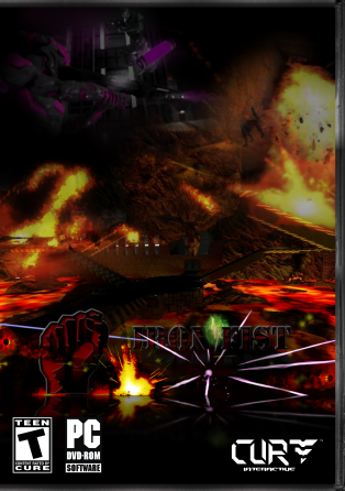
Iron Fist 2015


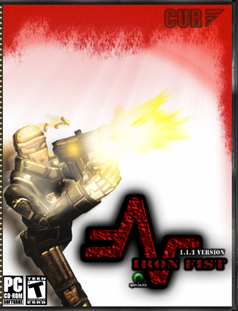
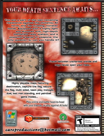
Iron Fist 2009

Code for This Render
The render requires one stage per interactive box and a six-sided box element (`front`, `back`, `top`, `bottom`, `left`, `right`). The page JavaScript then attaches pointer-drag rotation behavior to each stage ID.
<div id="boxart-stage" class="boxart-stage">
  <div class="boxart">
    <div class="boxart__side boxart__side--front"><img src=".../boxart-ft.png" alt="..."></div>
    <div class="boxart__side boxart__side--top"><img src=".../boxart-tp.png" alt="..."></div>
    <div class="boxart__side boxart__side--bottom"><img src=".../boxart-bm.png" alt="..."></div>
    <div class="boxart__side boxart__side--back"><img src=".../boxart-bk.png" alt="..."></div>
    <div class="boxart__side boxart__side--left"><img src=".../boxart-lf.png" alt="..."></div>
    <div class="boxart__side boxart__side--right"><img src=".../boxart-rt.png" alt="..."></div>
  </div>
</div>
Implementation Notes
- The page JavaScript binds pointer drag handlers to `boxart-stage` and `boxart-stage-2`.
- Rotation is tracked with quaternions and rendered to the `.boxart` element as a CSS `matrix3d(...)` transform.
- Release velocity is preserved briefly and decays over time to create inertial spin.
- A JS-positioned hitbox guide is drawn on the demo panel so the visible interaction boundary matches the real stage footprint without being mirrored by the reflection effect.
- This implementation intentionally omits the optional stage-target activation element so users drag the box directly.
- `-webkit-box-reflect` is optional visual polish and has inconsistent support across browsers.
Touch and mobile behavior can vary due to browser gesture handling, native pinch-zoom behavior, and CSS 3D support differences.
JavaScript Setup
This page-specific script initializes pointer drag behavior for each stage, applies quaternion rotation updates while dragging, and continues motion briefly using decaying inertia after release.
document.addEventListener('DOMContentLoaded', function () {
  initBoxartStage('boxart-stage', { rotateX: 0, rotateY: 45 });
  initBoxartStage('boxart-stage-2', { rotateX: 0, rotateY: 45 });
});
The page script also handles mobile scroll suppression during drag, motion-state performance fallbacks, and hitbox-guide positioning from the actual stage bounds.
Base CSS Pattern
The page stylesheet contains the full side transforms and dimensions. The snippet below shows the stage perspective and core box transform pattern only.
.boxart-stage {
  position: relative;
  width: 600px;
  height: 600px;
  perspective: 700px;
  perspective-origin: 50% 50%;
}

.boxart {
  position: absolute;
  top: 50%;
  left: 50%;
  width: 250px;
  height: 355px;
  transform: rotate3d(1, 0, 0, -40deg);
  transform-style: preserve-3d;
}
Files for This Page
project/example/in/example/interactive-3d-boxart.html- Page structure, renders, and code examples.project/example/in/asset/css/content/example/interactive-3d-boxart.scss- Demo layout styles and 3D box CSS.project/example/in/asset/js/content/example/interactive-3d-boxart.js- Page setup and pointer-drag rotation behavior for both stages.
Attribution
This page is comprised of my own additions and either partially or heavily modified elements from the following source(s):